Work
About
Let's talk
Work
About
Let's talk
Sarine Sofair
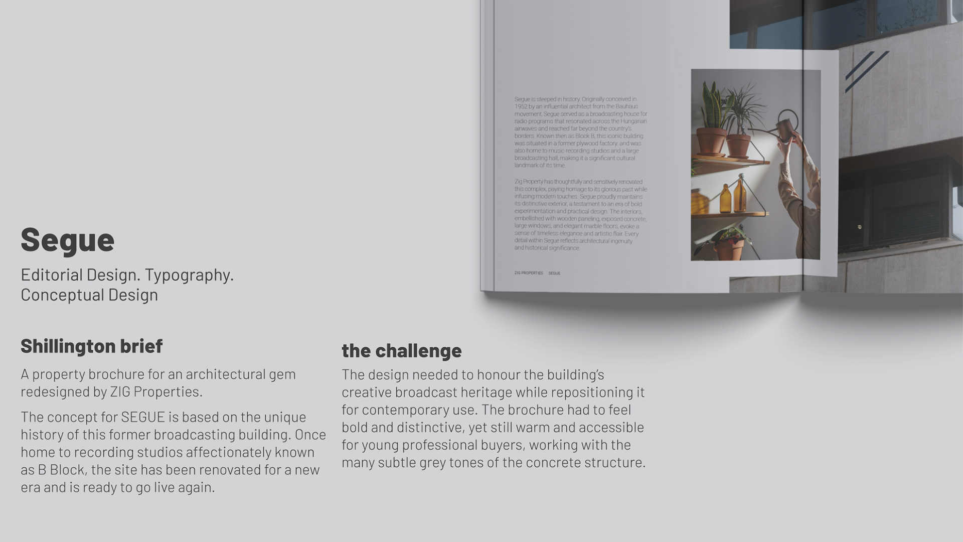
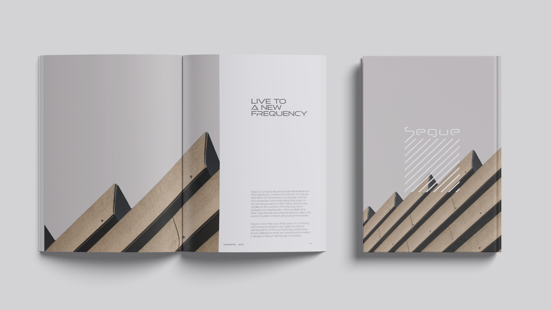
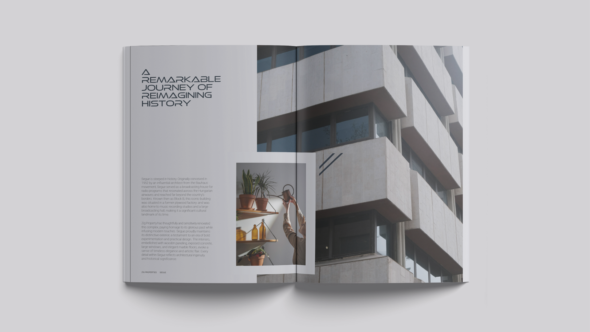
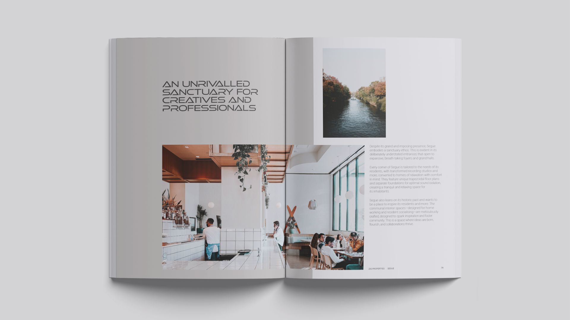
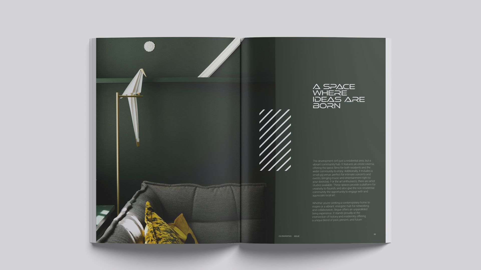
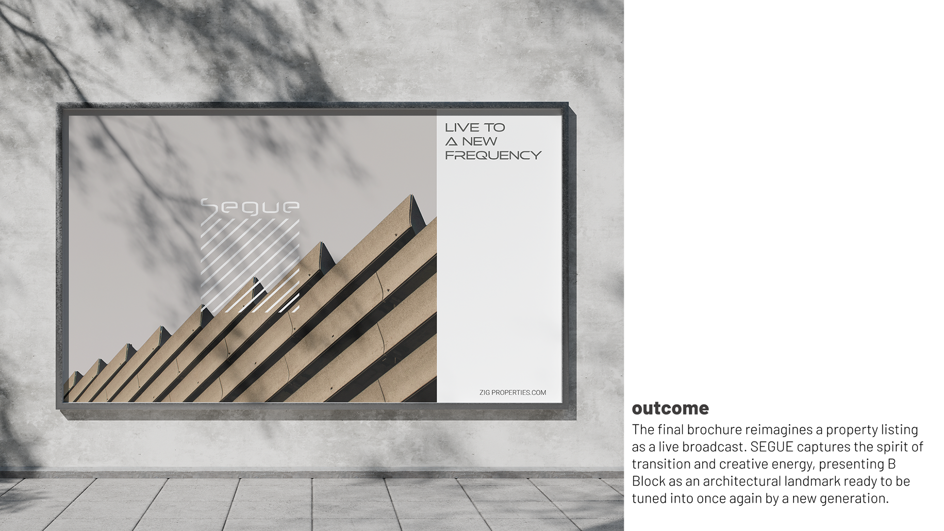
SEGUE
↑
Back to Top